Spark : The dating app designed for self-expression
Spark : The dating app designed for self-expression
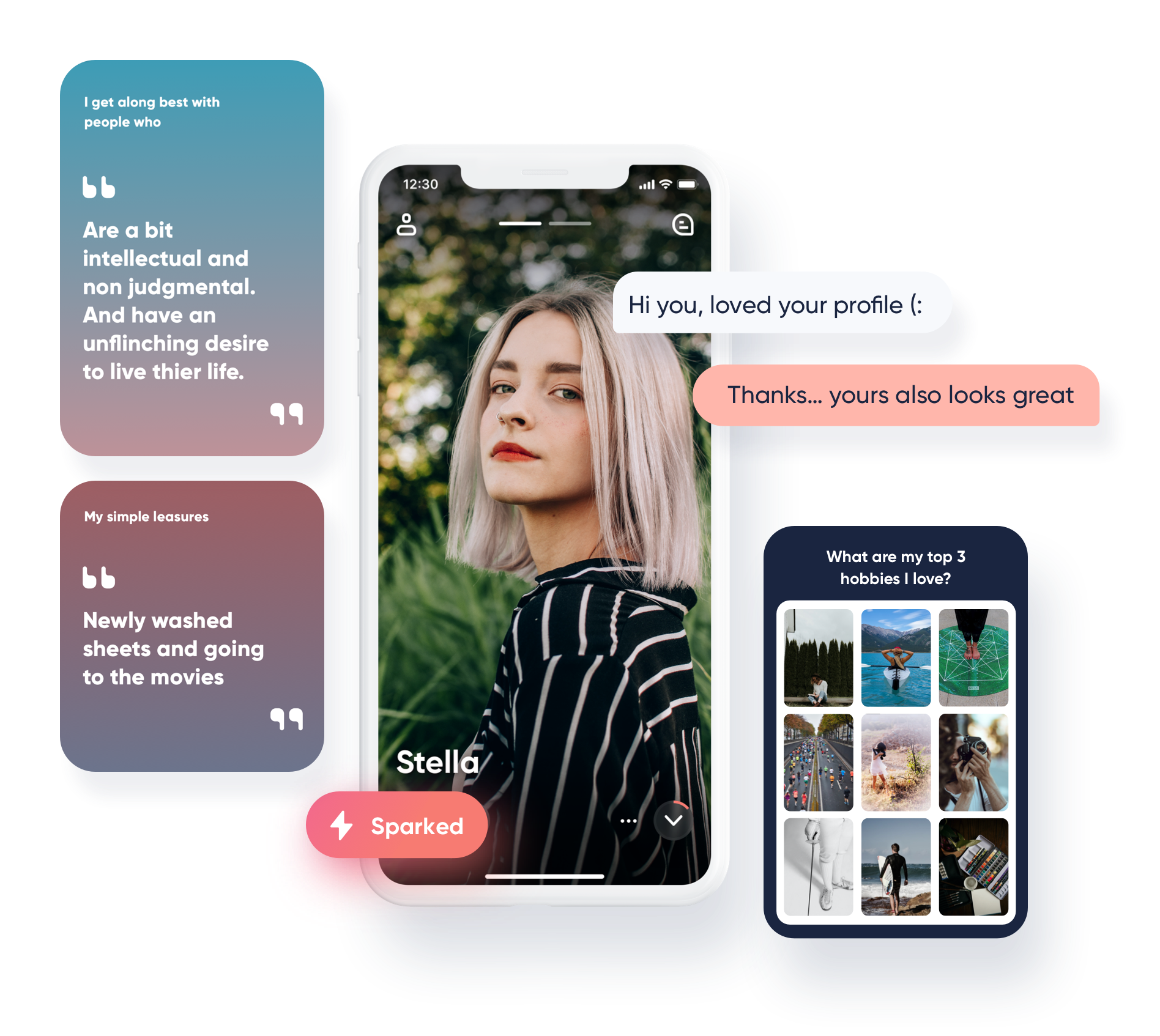
Spark is a dating app centered around the concepts of creativity and self-expression. Spark launched in Canada and opened in the US later. It is one of the portfolio brands of Spark Networks SE, a global leader in online dating with headquarters in Berlin and offices in New York and Utah.
Spark is a dating app centered around the concepts of creativity and self-expression. It is launched in June 2020 in Canada and opened US later. It is one of the portfolio brands of Spark Networks SE, a global leader in online dating with headquarters in Berlin and offices in New York and Utah.
My Role
I was responsible for all major UX deliverables such as user flows to high fidelity design from end to end.
As a product designer, I worked in developing the key features and visual design and the design system as well as the tech team in managing what was possible within the confines.
Deliverable
Ideation
User Research
Concepting
User flows
Visual design
UI components
Interaction design
End-to-end prototype & testing
Ideation
User Research
Concepting
User flows
Viusal design
UI components
Interaction design
End-to-end prototype & testing
Team
Project Lead
Brand Lead
Product Marketing Manger
Brand manager
Developers (5)
Data Analyst
UX/UI Designer
Project Lead
Brand Lead
Product Marketing Manger
Brand manager
Developers (5)
Data Analyst
UX/UI Designer
Timeline
6 Months
6 Months
The Problem
So sick of endless swiping
The online dating culture of swipes, clicks and likes has become a natural part of the modern dating scene over the past decade. Despite the endless flow of profiles and photos, many are lonely desperate to swipe, and completely tired of having their date. And people judge others through the superficial pictures and details within seconds.
Key Pain points
1
Nothing comes from dates because quality of matches is too low.
2
Going on a date with someone who has mispresented themselves
3
lack of ways for users to express themselves who they are.
User Research
Deep Dive into Users
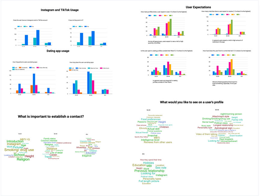
To understand users’ behavior and learn more about any further pain points, we conducted a user survey through our other dating app platform. There are 362 participants, 2 Homosexual participants, and 0 Non-binary individuals.
Key insights
Mostly searching for long-term relationships, or marriage.
Across all demographics, users report using dating apps mostly on a daily basis.
The younger, a user is – the more likely they are to have an Instagram or TikTok account and post to it.
As age increases, the user places more salience on children, past relationships, and ensuring that they’re both looking for similar things.
Core value

- Meet Qulity Matches
- Enjoy using Spark
- Trust Spark brand
- Expand Dating circle
- Enable Qulity match
- High retention rate
- Unique features
- Expand user base
Platform engagement
Platform engagement
Opportunity
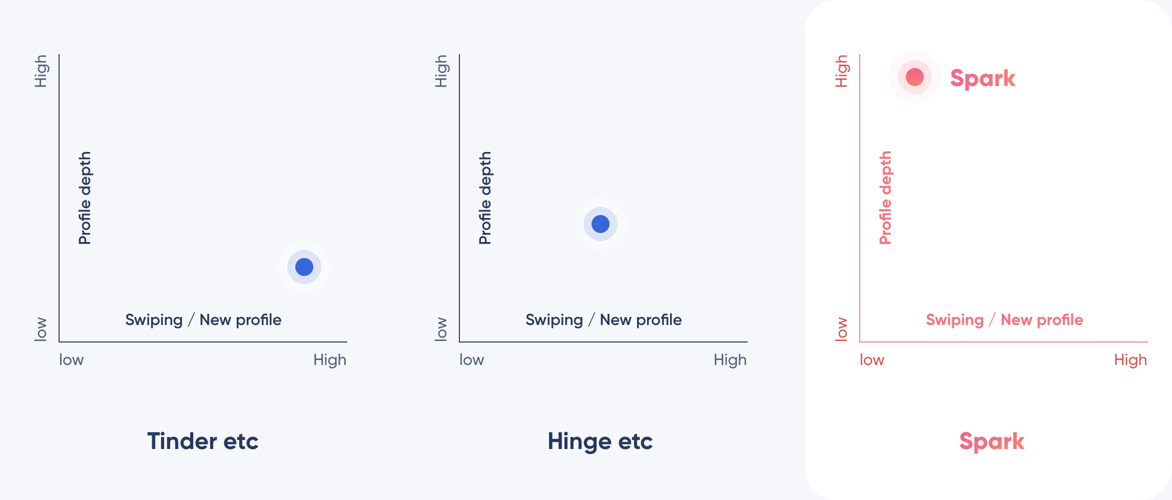
How might we help users express who you are instead of saying it?
How might we help users express who you are instead of saying it?
How might we bring more features into Spark that help improve its quality to match its impressive quantity?
How might we bring more features into Spark that helps improve its quality to match its impressive quantity?
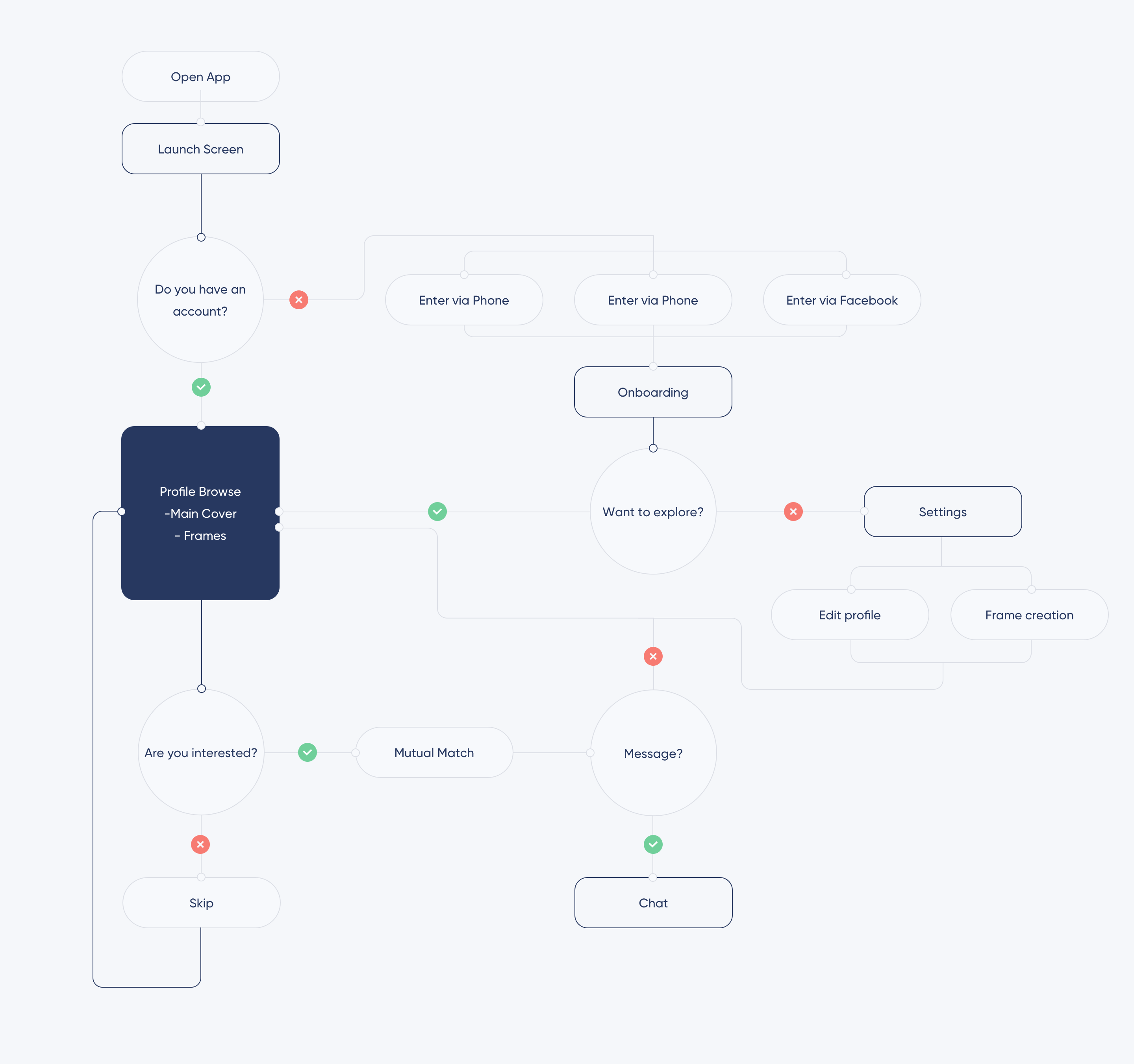
User flow
User flow
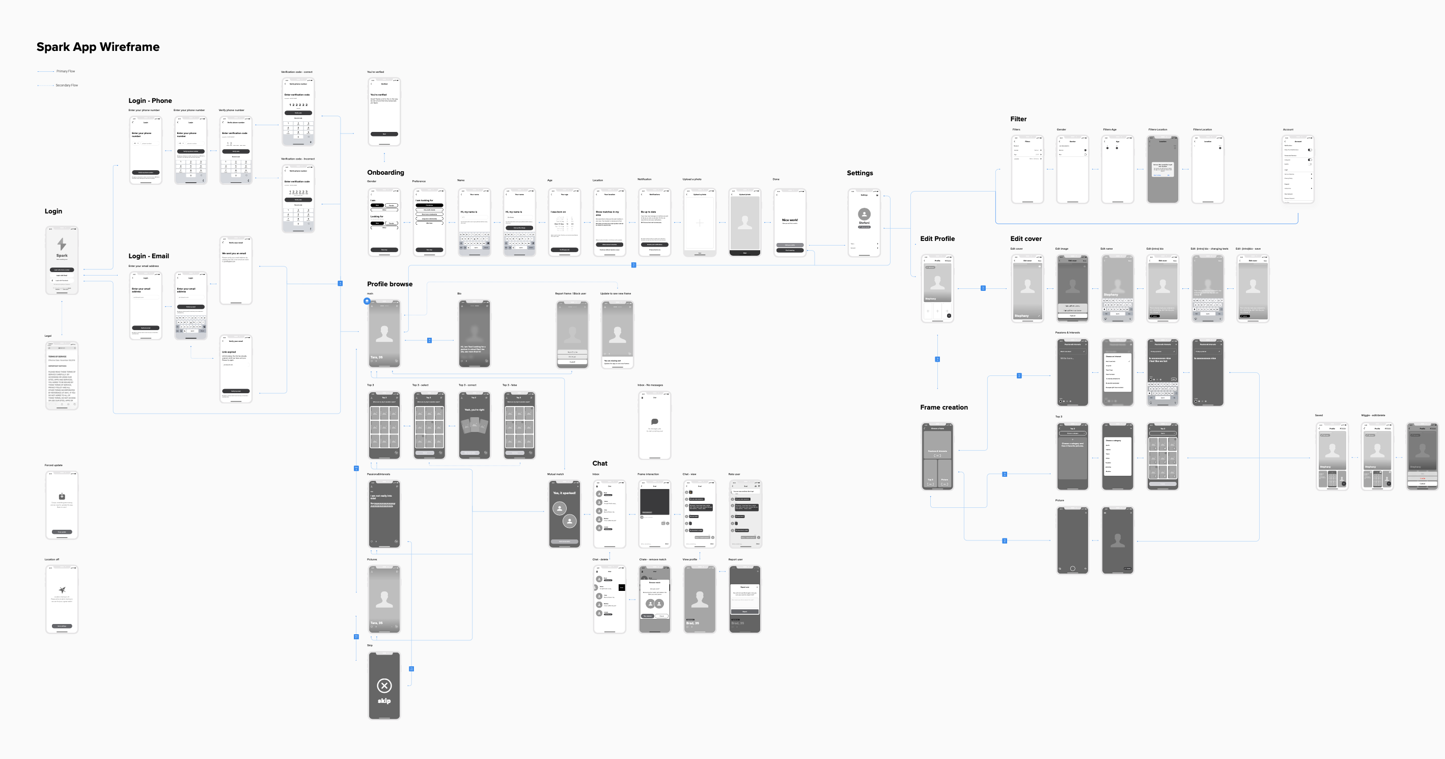
Wireframe
Typography&Colors
Typography&Colors
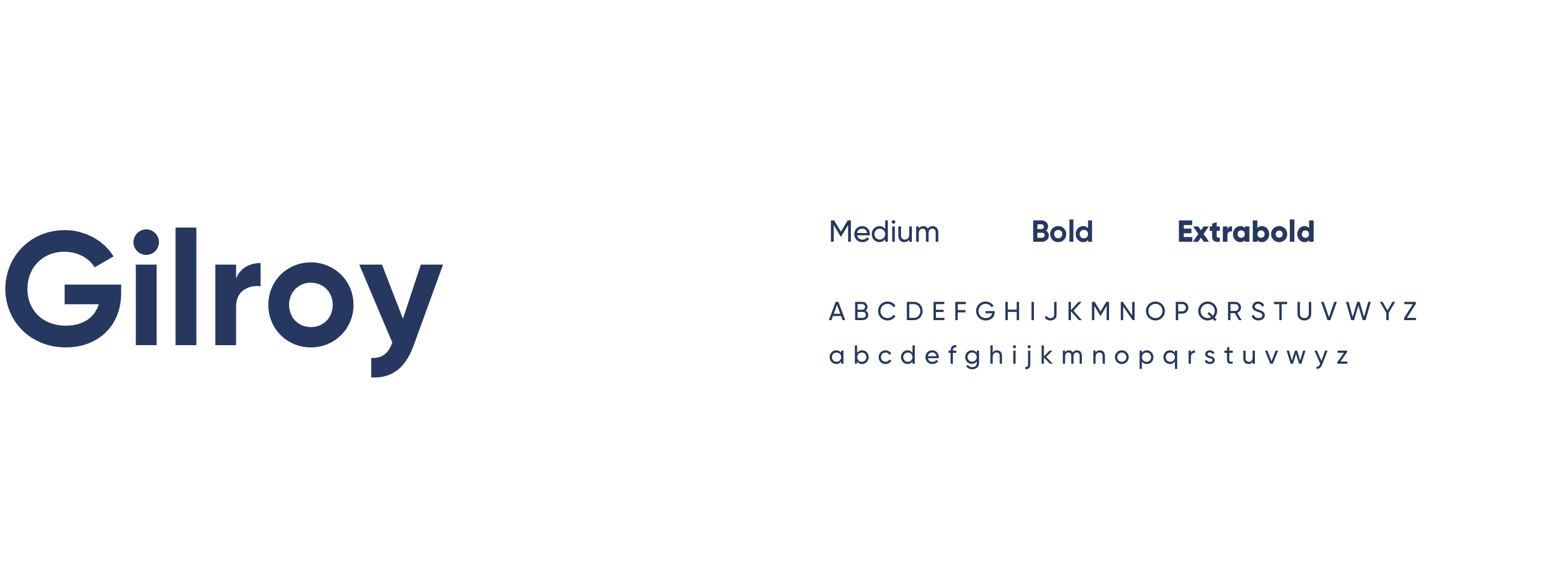
Gilroy designed by Radomir Tinkov was chosen for the project as it reflects the idea of simplicity and geometric touch.
Gilroy designed by Radomir Tinkov was chosen for the project as it reflects the idea of simplicity and geometric touch.

Iconography
Iconography
Validation
Validation
Concept Testing
The main target of the focus groups was to figure out if there's a demographic that the two new concepts of the app, which are instant matches and fully customizable profiles with frame templates, are best perceived.
The focus group was a success if afterward, we were able to agree on a target audience so we can come up with a tailored value proposition and brand positioning for the defined audience.
Spark Focus group
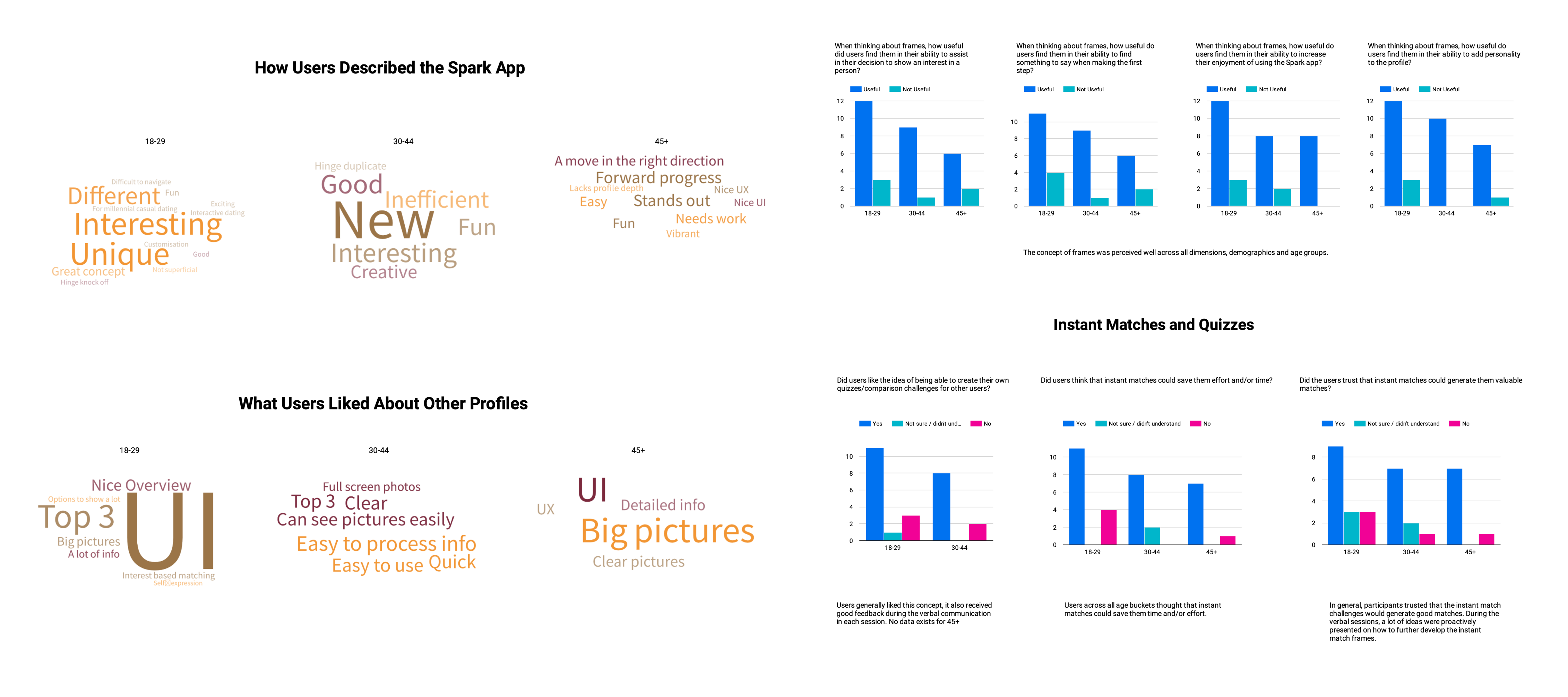
The focus group consisted of 33 individuals in 3 different age buckets; 18-29, 30-44, and 45+ respectively containing 15, 10, and 8 participants.
Participants were qualitatively selected out of ~400 dating app users that replied to our initial survey.
Key takeaways
Almost all users would use the Spark app.
Most users described the app in a positive manner; the most common descriptions were "unique", and "interesting".
Users found the app less superficial and more interactive than competitors.
Amongst competitors, users associated the app most closely with Bumble and Hinge.
Most users liked the concept of instant matches/ quizzes and placed their trust in the system.
In general, participants liked the concept of frames, and found them useful for:
Assist in decision making
Finding a conversation starter
Increasing their enjoyment of spark - Express their personality
Almost all users would use the Spark app.
Most users described the app in a positive manner; the most common descriptions were "unique", and "interesting".
Users found the app less superficial, and more interactive than competitors.
Amongst competitors, users associated the app most closely with Bumble and Hinge.
Most users liked the concept of instant matches/ quizzes, and placed their trust in the system.
In general participants liked the concept of frames, and found them useful for:
Assist in decision making
Finding a conversation starter
Increasing their enjoyment of spark - Express their personality
Opportunities for improvement
The 18-29-year-olds found the onboarding slightly more difficult than other age groups, this should be evaluated further in a focus group specific to this issue.
The current method of skipping profiles without going through all frames, and/or the way we explain it, can be improved as it's currently not coherent enough.
More frames need to be added to increase the amount of information presented in proles. Especially the way we collect and present hard facts requires solid thought and is a must-have to launch.
The filters can be expanded to cover important hard facts and thus increase the trust in our suggested profiles.
Outline
Outline
The focus group sessions were very successful as they allowed us to dene our potential target audience, which is broader than initially expected (18-44), proved that the concepts we've invented work for a broad demographic, and gave us early insights on areas of development for our app that we can act on.
Final Outcome
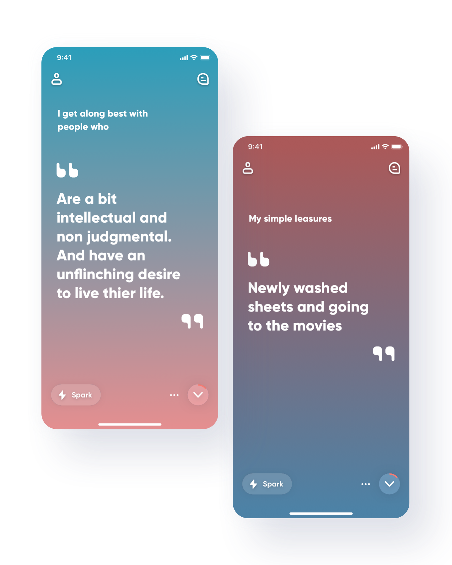
You’re more than Bio!
We believe that people are more than just a bio, which is why we designed Spark around the concept of 'frames.' These include photo filters and interactive question cards that allow users to curate a unique profile, and match with others on what matters to them.
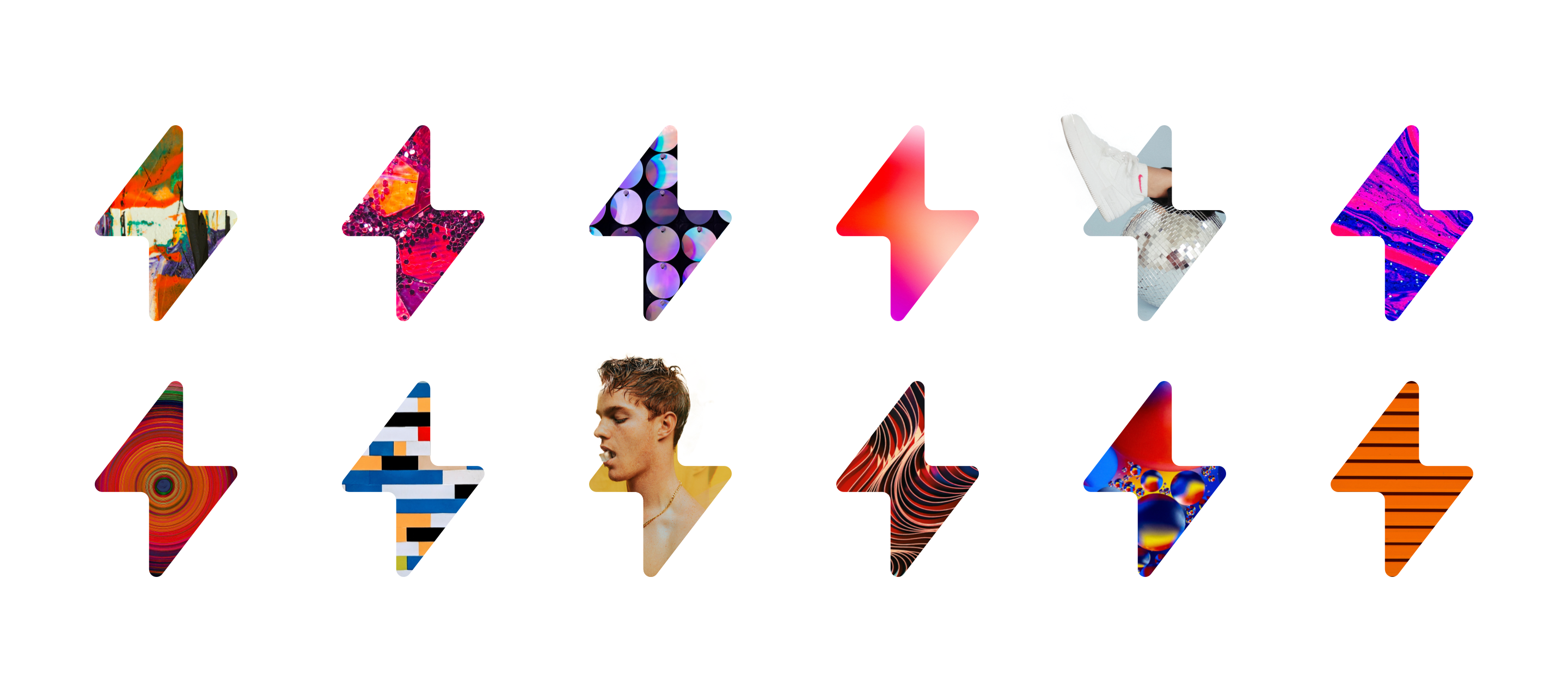
What is Frame?
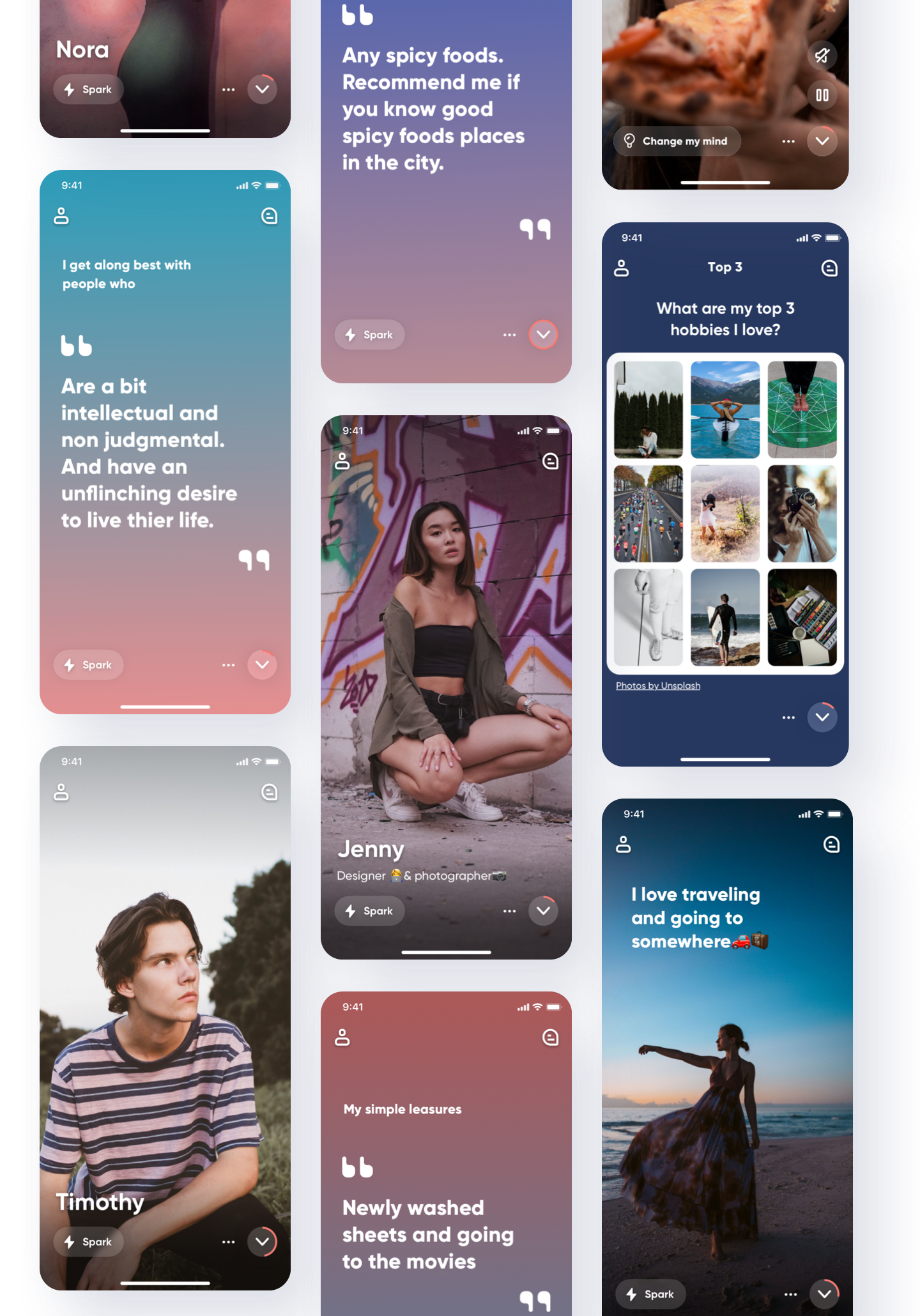
Frame is the main key feature that help user express who you are. It consists of various other types. Each frames are shown as full screen. you can see user’s frames through scrolling.
There is no swiping
We would like to encourage all our users to get to know more about their matches before making a decision, which is why there is no swiping. You can either scroll through the Frames, or you can use the skip button to jump from Frame to Frame. Send a Spark to show your interest when you find a Frame you like. A match is created when the other user sends a Spark as well.
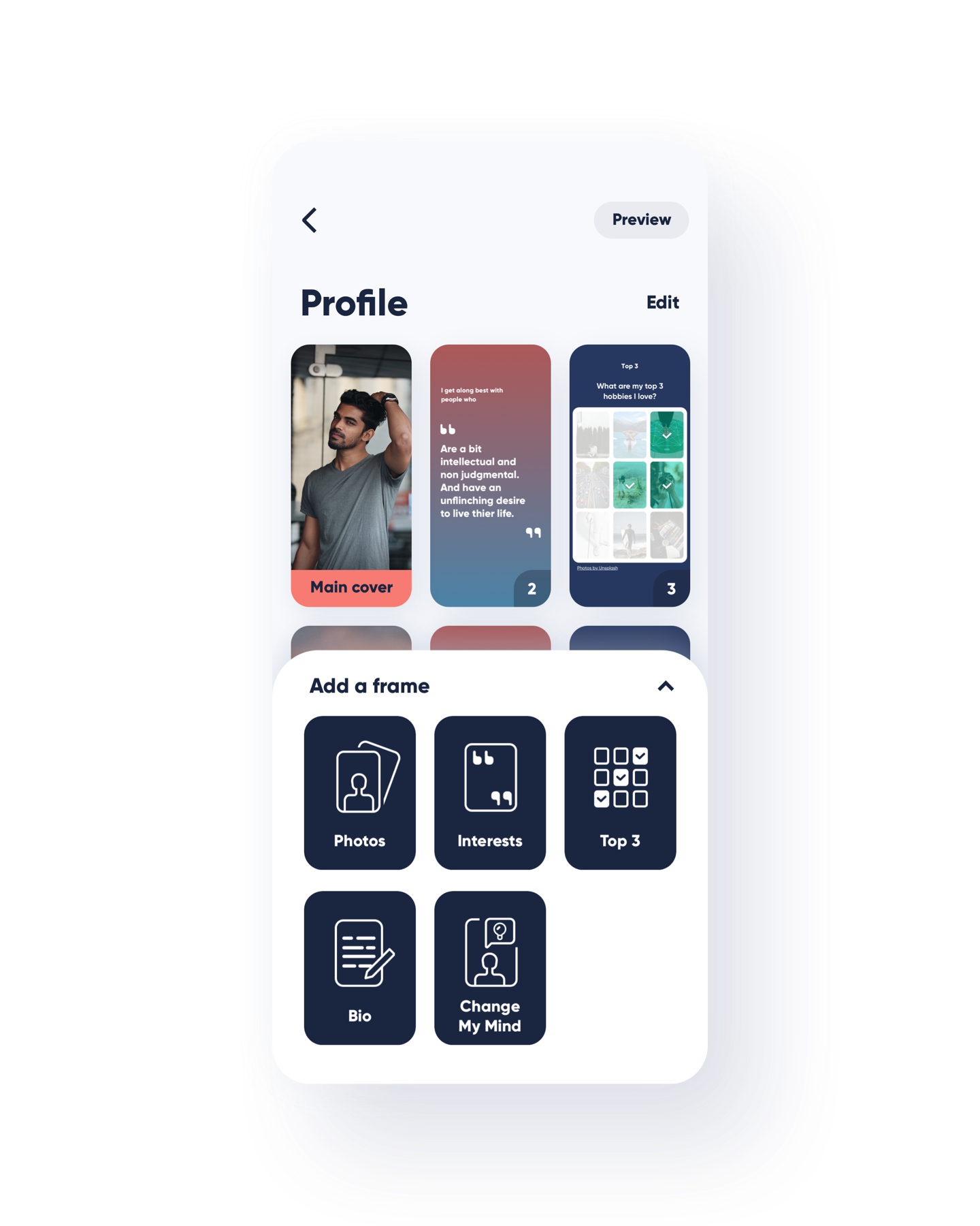
Make frames to express who you are
Each Spark profile consists of “Frames“ and user can add as many as they like. we proposed that user can then choose from various other Frame types.
Not the same old story
We want to put a stop to conformity by giving you the right tools to express yourself through more than just few words and photos. This makes every profile a unique and new discovery. We only ask you the essential questions to get started upon signing up. Then it’s up to you to design your profile the way you like it.
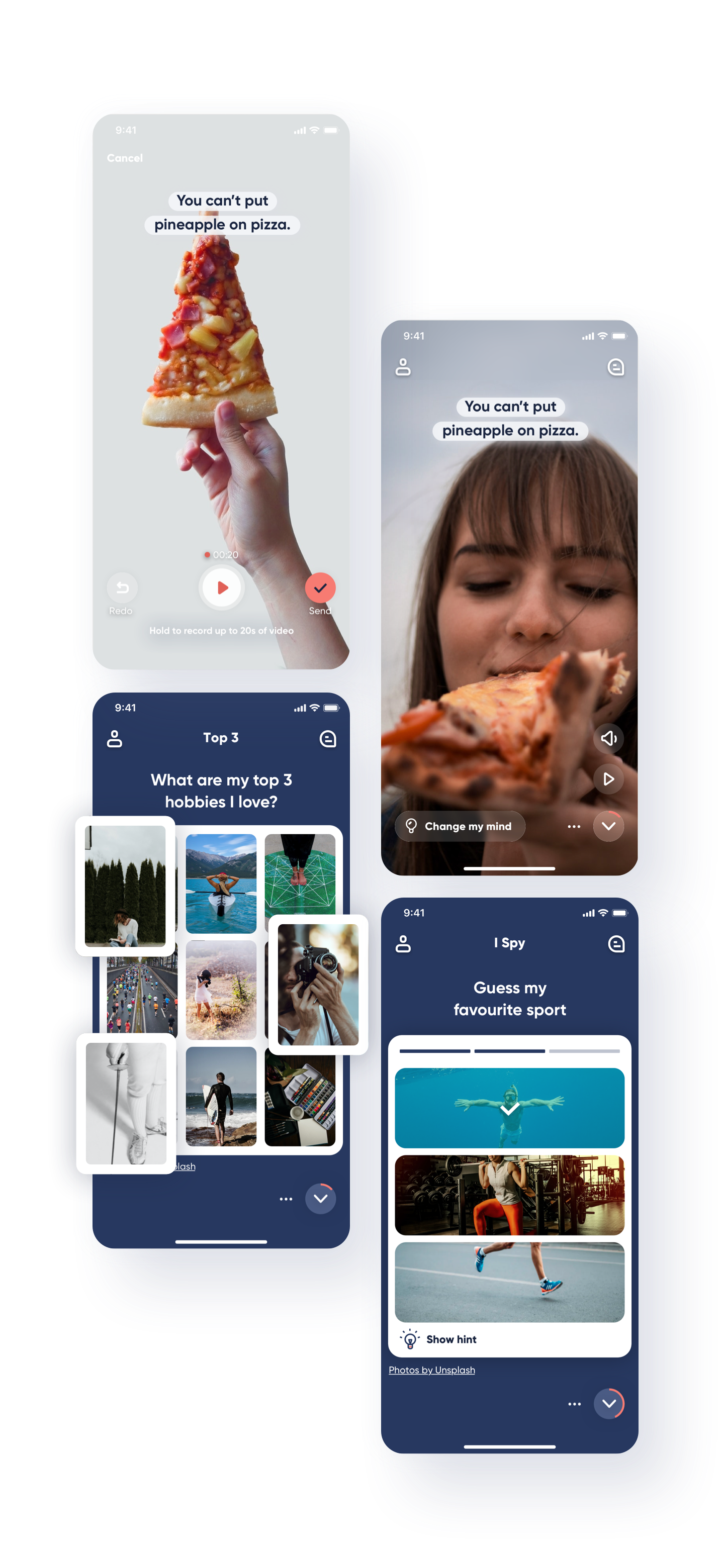
Dating should be fun
Frame types include games and challenges to show your personality and help you match with like-minded people. A user that solves the challenge you designed will become your match and you can instantly begin chatting. This way you can get matches knowing that you and your new connection have something in common without spending hours swiping and making the first move.
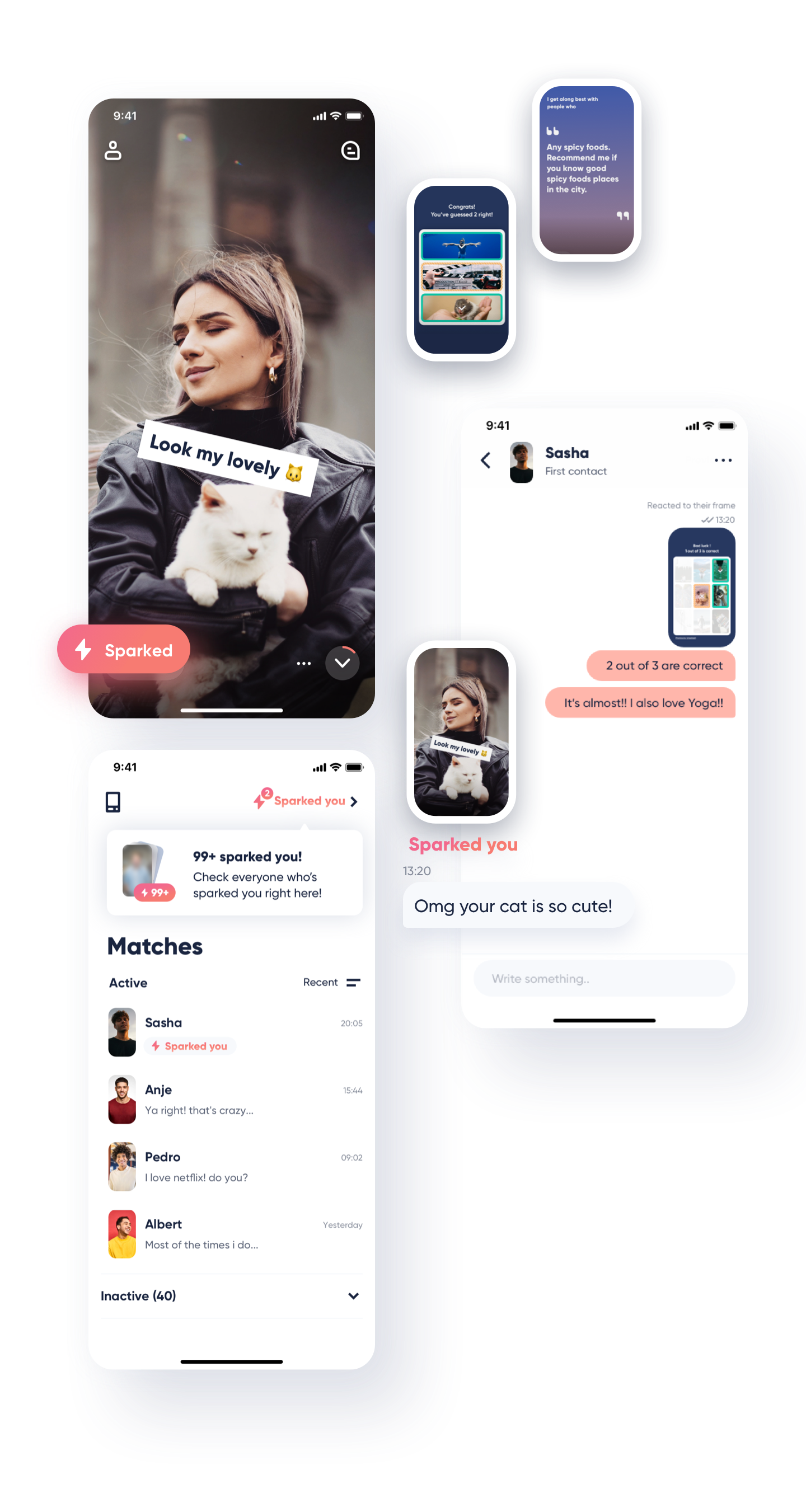
Engaging icebreakers
We created different Features to more engaging icebreakers that would get conversations started on the right foot.
Retrospective
It was challenging to design a dating app pursuing a different way to compete with dating market leaders. Since I didn’t have any data or knowledge background about the dating app, I had to deeply understand the user’s behavior and circumstance. It was great learning in user’s behaviors and user’s need in the dating market.
Thank you for watching!
© 2023 tei.design. All rights reserved.
